Welcome to the Search Insights guide! This article provides an overview of the various visualization tools and settings available to help you analyze and interpret your search results. You’ll learn how to use network graphs, heatmaps, scatter plots, and more to gain deeper insights from your data. We’ll also cover the menu options that let you adjust parameters, select specific visualizations, and export your analysis for future reference. Let’s dive in!
- What: Visualization Space
Description: Here, you can gain further insights from your search results from a range of visualisations: Co-occurrence of MeSH Terms (Network Term Analysis), Heatmap MeSH Term Analysis(depending on what you selected in the menu below), records clustered by semantic similarity (Embedding Scatter Plot), and a Biocompatibility Plot. By default, the Number of Records and the Number of Top MeSH terms are set to 250 and 10, respectively. These parameters can be adjusted in the settings (please also see Analysis Page, 2.3).- Network Term Analysis
The size of a node encodes the absolute count of a certain term, the width of the edges encodes the frequency of two terms co-occurring. Double-clicking on a node (1) displays all the publications where the selected MeSH term appears, as well as (2) highlights the co-occurring MeSH terms.- Left Panel: A visualisation of the co-occurrence of the most frequent MeSH terms. The default number of MeSH terms is set to 10.
- Right Panel: A visualisation of the co-occurrence of the most significant MeSH terms. Significance is measured by comparing the frequency of terms in a subset of data (the foreground) to their frequency in the entire dataset (the background).
- Heatmap MeSH Term Analysis
This visualisation presents the same information as in 1.1 Network Term Analysis, but as heatmaps indicating the number of publications where each co-occurrence of two MeSH terms appear. By clicking on a coloured cell, a list of the publications matching the co-occurrence of either the Most Frequent (left panel) or Significant (right panel) MeSH Terms will be displayed.- Left Panel: A visualisation of the co-occurrence of the most frequent MeSH terms by number of publications in which each pair of MeSH terms appear.
- Right Panel: A visualisation of the co-occurrence of the most significant MeSH terms by number of publications in which each pair of MeSH terms appear. Significance is measured by comparing the frequency of terms in a subset of data (the foreground, in this case the subset of publications resulting from the specific search) to their frequency in the entire dataset (the background, in this case the entire dataset of publications the database).
- Embedding Scatter Plot
In this scatter plot, each dot represents a publication. Publications that are close to each other have a semantically similar abstract. The colour encodes the ranking score, which is also used in the search. This visualisation can help you, for instance, to discover articles that you would have likely not seen given their low ranking score but which are semantically similar to top-ranked articles.
In brief, this AI-driven application analyses each publication abstract by converting the text into computed values (called “embedding vectors”) that represent the main content. These values are plotted on a 2D graph, with similar ideas positioned closer together. This visual representation allows users to easily identify clusters of similar papers within a research topic.
It works by creating these “embedding vectors” for each abstract, generated by a specialised language model (a fine-tuned version of BERT). During training, the model “learns” the semantic context, embedding it into these high-dimensional vectors. Previous research has shown that projecting these embedding vectors into 2D space (using UMAP) is an effective way to cluster or compare text based on semantic similarities. - Biocompatibility Plot
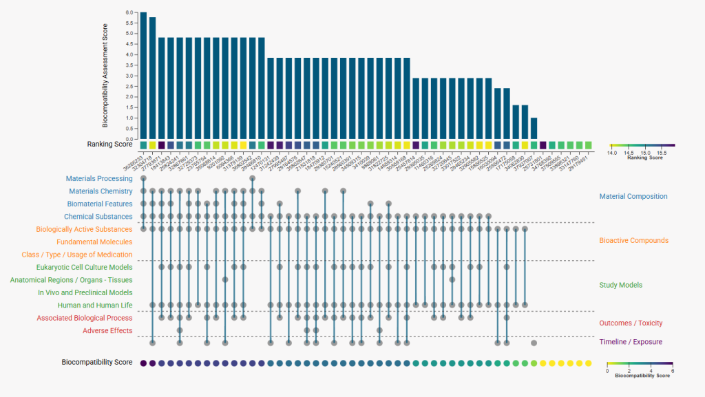
The UpSet-style plot presents the Biocompatibility Assessment Study Score for the top 50 publications in relation to their previously computed ranking scores. The bar height represents the number of matched sublabels, while each study’s color-coded ranking score is displayed at the bottom of each bar. Below the ranking score, the corresponding PUBMED ID is written diagonally. The dotted matrix categorizes sublabels into superfamilies, including Materials and Material Composition, Bioactive Compounds, Study Models, Outcomes & Toxicity, and Experimental Timeline or Exposure. Grey circles indicate the specific sublabels present in each document, allowing for a clear visualization of both overall scores and detailed sublabel distributions. Each study’s biocompatibility assessment score is also shown in a color-coded format beneath the plot.
- Network Term Analysis
- What: Menu
Description: This menu allows you to switch between visualisations (Viewers tab), modify the settings (Settings tab), see and modify the search parameters (Search Parameters tab), display a list of search results (All Publications tab), and export the analysis results (Export tab).- Visualisations tab
Allows you to change between the different visualisations previously described - Settings tab
- Number of Records: This specifies the number of search results included in the analysis. We recommend including a minimum of 10 and a maximum of 500 to obtain the best possible results in terms of the quality of the analysis and the computation time.
- Number of Top MeSH Terms: Here you can change the number of MeSH terms that will be considered for the co-occurrence analysis. By default, this is set to 10 MeSH terms.
- Search Parameters tab
Here, you can see and modify the search query and parameters for the search being analysed. Any changes to the parameters made using this tab will enable you to stay on the Analysis Page and will automatically update the associated visualisations. - All Publications tab
Here, you can find a list of all the publications identified in the search.By default, the first five publications are shown, but selecting “load more” will display the top 250 publications. - Export tab
Here, you can export the analysis results (visualisations and statistics) in a PDF format. To save one or multiple publications to your collection please click the ‘Save’ button next to the publication.
- Visualisations tab
With this guide, you should have a good understanding of the visualization options and settings available in the Search Insights. Feel free to explore and experiment with different views and parameters to discover insights in your data. If you have any questions or need assistance, don’t hesitate to reach out. Happy analyzing!


